FloresForm StudioFORM FOLLOWS FEELING
PROSTOR U RITMU ŽIVOTA

Keramičke površine u interijeru: od fotografije do stvarnog prostora

Što provjeriti prije kupnje i zašto uzorak koji nas je osvojio na prikazu u stvarnom prostoru ponekad izgleda sasvim drugačije

Vrlo često, posebno danas kada nam je gotovo sve dostupno online, prvi susret s nečim što nam je trenutačno u fokusu događa se putem fotografije. U ovom kontekstu, prikazi stvarnih ili renderiranih interijera postaju smjernica prema onome što tražimo ili čime se inspiriramo.

Govorimo li o keramici, ona je na dobroj fotografiji smještena u prostor skladnih proporcija i okružena bojama koje joj „laskaju”. U takvom kadru djeluje mirno, profinjeno i savršeno skladno. No fotografija prikazuje atmosferu, a rijetko sve ono zbog čega bi ta keramika jednako dobro izgledala u našem prostoru i što bi trebalo utjecati na konačan odabir.

Između inspiracije i dobre odluke stoga postoji važan korak – keramiku ne promatramo kao izdvojen uzorak, već je zamišljamo kao površinu pod svjetlom koje će je osvjetljavati, uz odabrane fuge, u formatu koji odgovara prostoru i u količini koja će otkriti puni ritam i karakter uzorka.

Dobra pločica nije samo ona koja nam se sviđa, već ona koja odgovara prostoru, načinu života i uvjetima u kojima će biti postavljena.

Fotografija nije neutralan prikaz
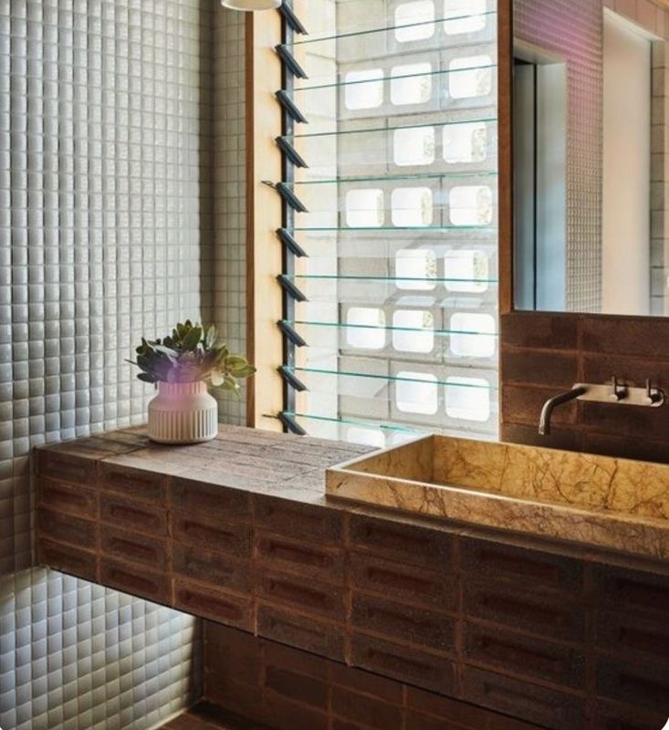
Bellows House · Fotografija: Derek Swalwell

Fotografije interijera oblikovane su svjetlom, objektivom i naknadnom obradom. Topla rasvjeta iz sivog tona može izvući bež podton, hladno dnevno svjetlo naglasiti plavičastu nijansu, a širokokutni objektiv stvoriti dojam prostranosti koji u manjem prostoru neće biti jednak.

Važno je promatrati i okruženje. Ono što izgleda nježno uz vapnenobijeli zid može djelovati hladno uz čisto bijelu boju. Smeđi uzorak može izgledati plemenito uz drvo, a znatno izraženije uz metal ili crni namještaj. Boju stoga nikada ne procjenjujemo samu, već u odnosu na sve ono što će se uz nju nalaziti.

Jedan uzorak ne pokazuje cijelu površinu

Mali izložbeni primjerak tek pokazuje dio grafike – tek nekoliko pločica posloženo jednu uz drugu otkriva ponavlja li se motiv, koliko su vene izražene i je li konačni dojam miran ili dinamičan. To je posebno važno za pločice koje imitiraju kamen, mramor, terrazzo ili pak ručno obrađene površine.

Oznake varijacije tona najčešće se kreću od vrlo ujednačenih do izrazito raznolikih serija. Kod većih varijacija pojedine pločice mogu izgledati gotovo kao različite nijanse istog materijala. To nije nužno nedostatak – često je upravo ono što površini daje dubinu. No takav izgled mora biti svjestan izbor, a ne iznenađenje nakon polaganja.

Prije odluke svakako je poželjno pogledati nekoliko komada iz iste kolekcije, a kod naglašene grafike barem fotografiju veće položene površine

Format mijenja doživljaj prostora
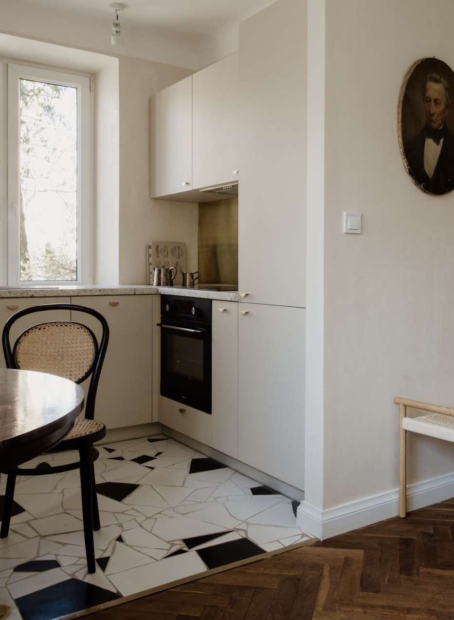
Wiktorska kitchen · Studio La Follie

Veliki format uglavnom „donosi“ manje fuga i mirniju, kontinuiranu površinu. Ipak, nije automatski najbolje rješenje za mali prostor ( iako može biti). Raspored sanitarija, niše, kutovi i padovi prema odvodu mogu zahtijevati podosta rezanja, pa pločica koja je u katalogu djelovala monumentalno na kraju može biti podijeljena na niz manjih i nepravilnih dijelova što vizualno ne pruža najbolji dojam.

Manji formati stoga bolje prate složenu geometriju poda, dok dugačke pravokutne pločice snažno određuju smjer pogleda. Način polaganja – ravno, na pomak, riblja kost ili kombinacija formata – mijenja ritam jednako snažno kao i boja, zato je preporučljivo prije konačne odluke i kupnje napraviti jednostavan nacrt polaganja, osobito kod velikih formata i prostora s mnogo prekida.

„Mat“, „sjajno“ i „strukturirano“ nisu samo estetske oznake

Završna obrada mijenja način na koji površina prima svjetlo. Sjajna pločica reflektira okolinu i može prostor učiniti svjetlijim, no na njoj se lakše primjećuju kapljice, tragovi i nepravilnosti podloge. Mat površina djeluje smirenije, dok reljef i izražena tekstura stvaraju sjene koje na fotografiji često izgledaju suptilnije nego uživo.

Kod podnih pločica, osobito u kupaonicama, tuševima, na ulazima i vanjskim prostorima, izgled nije dovoljan kriterij – potrebno je provjeriti deklariranu namjenu i protukliznost proizvoda za konkretne uvjete. Međutim ni oznaka sama po sebi nije univerzalna garancija – važni su i očekivana vlaga, obuća ili hodanje bosim nogama, način održavanja i preporuka proizvođača.

Završna obrada nije samo pitanje izgleda. Ona određuje kako površina prima svjetlo i kako je doživljavamo u svakodnevici.

Fuga je dio dizajna, ne tehnički ostatak
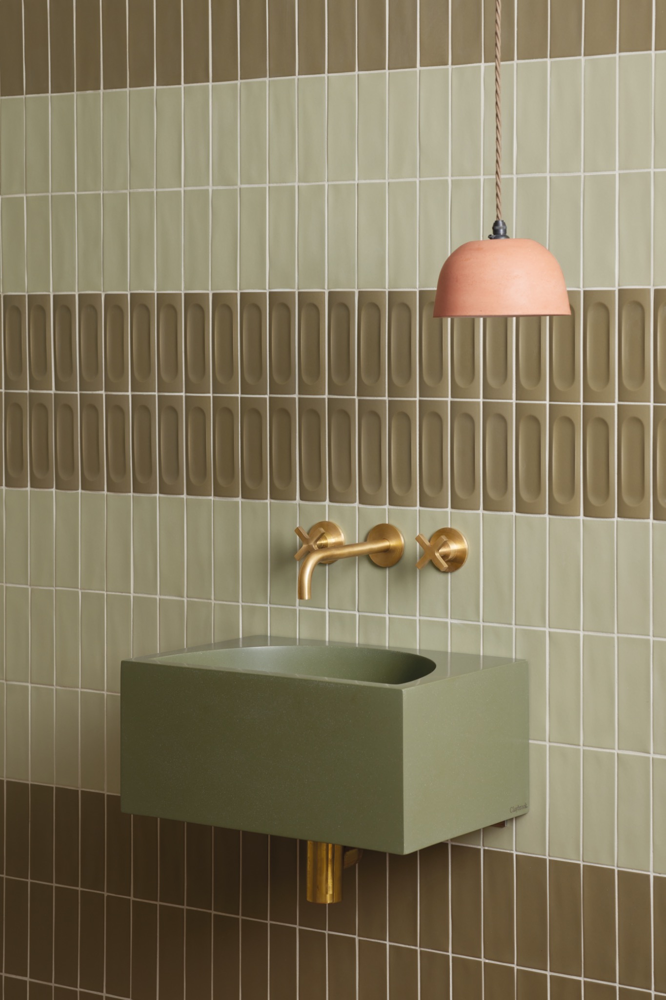
Tavolozza u nijansama Moss i Meadow · Claybrook Studio

Boja i širina fuge mogu pločicu povezati u gotovo kontinuiranu plohu ili pak naglasiti svaki pojedini komad. Fuga u tonu površine smiruje raster – kontrastna fuga ističe format, smjer polaganja i svaku malu razliku u pločicama.

Rektificirani rubovi omogućavaju preciznije i uže spojeve, ali ne znače polaganje bez fuge. Potrebna širina ovisi o dimenzijskim odstupanjima pločice, o tome koliko je podloga ravna, formatu, mjestu primjene i uputama proizvođača. Preuska fuga može dodatno naglasiti i najmanju nepravilnost.

Najsigurnije je odabranu pločicu i nekoliko mogućih boja mase za fugiranje pogledati zajedno, na istom svjetlu na kojem smo procjenjivali i samu pločicu.

Ista kolekcija ne znači uvijek isti ton

Keramički proizvodi izrađuju se u proizvodnim serijama. Između različitih serija mogu postojati male razlike u tonu i kalibru koje su na jednom komadu gotovo nevidljive, ali na velikoj površini postaju jasne. Zato treba provjeriti jesu li sve kutije iz iste šarže i iste oznake dimenzije.

Rezervu ne kupujemo samo radi lomova - ona pokriva rezanje, odabir rasporeda grafike te moguće buduće popravke i onda kada identična serija keramike više neće biti dostupna. Uobičajena polazna procjena je 10 do 15 posto više od neto površine, ali stvarni dodatak ovisi o formatu, načinu polaganja, broju kutova te složenosti prostora. Konačnu količinu dobro je potvrditi s projektantom ili izvođačem.

Na što se osvrnuti prije kupnje

Fotografija nam ne govori kojem je dijelu prostora proizvod namijenjen – podu ili kao zidna obloga, odgovara li mokroj zoni, vanjskom prostoru ili podnom grijanju. Ne moramo sami tumačiti sve tehničke oznake, ali bilo bi dobro znati postaviti prava pitanja i zatražiti tehnički list proizvoda.

Kod velikih formata vrlo je važno razgovarati s izvođačem – za konačni rezultat nisu presudno samo boja i uzorak nego i priprema podloge, mogućnost rezanja, odabrani način polaganja i iskustvo osobe koja će pločicu ugrađivati. Dizajnerska zamisao i kvalitetna izvedba moraju raditi zajedno.

Najvažniji test događa se u samom prostoru

Ako je moguće, uzorak je najbolje ponijeti sa sobom – ne samo malu pločicu iz mape, već cijeli komad ili nekoliko njih. Postaviti ih okomito i vodoravno, uz postojeći pod, drvo, boju zida i metalne elemente te ih pogledati ujutro, poslijepodne i navečer, pod umjetnom rasvjetom.

Ostaviti ih u prostoru barem dan ili dva i ne povesti se samo za prvim dojmom. Ponovljeni pogled otkriva možemo li s tim materijalom doista živjeti. Tada se često pokaže da diskretnija varijanta ima više dubine od očekivanog ili da snažan uzorak, privlačan na fotografiji, u stvarnom prostoru traži više mira oko sebe.

Fotografija je sjajno mjesto za početak. Ona nam otkriva atmosferu koju želimo, odnose boja koji nas privlače i smjer u kojem bismo mogli krenuti. Ali dobra odluka nastaje tek kada inspiraciju prenesemo u konkretan prostor – njegove proporcije, svjetlo, navike i tehničke zahtjeve.

Pločica tada prestaje biti samo lijepa slika. Postaje dio svakodnevice – površina po kojoj hodamo, koju dodirujemo, čistimo i gledamo iz dana u dan. Upravo zato vrijedi odvojiti vrijeme da ju „upoznamo“ prije nego je odaberemo.

Jer prostor ne nastaje iz jednog uzorka. Nastaje iz pažljivo promišljenih odnosa i iz osjećaja koji želimo sačuvati kada fotografija više nije pred nama.
FORM FOLLOWS FEELING

Ceramic Surfaces in Interiors: From Photography to Real Spaces

What to consider before buying, and why a tile that captivated us in a photograph can look entirely different in a real space.

Very often, especially today, when almost everything is available to us online, our first encounter with something that has caught our attention happens through a photograph. Images of real or rendered interiors become a point of reference for what we are looking for, or what inspires us.

When it comes to ceramics, a beautifully photographed tile is placed within a space of harmonious proportions, surrounded by colours that flatter it. In such a setting, it appears calm, refined and perfectly balanced. Yet a photograph captures an atmosphere, rarely all the conditions that would make the same tile look equally good in our own space or that should influence our final choice.

Between inspiration and a good decision lies an important step. Rather than looking at a tile as an isolated sample, we need to imagine it as a surface under the light that will illuminate it, alongside the chosen grout, in a format suited to the room and across an area large enough to reveal the full rhythm and character of its pattern.

A good tile is not simply one we like. It is one that suits the space, the way we live and the conditions in which it will be installed.

A photograph is never a neutral representation

Bellows House · Fotografija: Derek Swalwell
Bellows House · Photography: Derek Swalwell

Interior photographs are shaped by light, lenses and post-production. Warm lighting can draw beige undertones out of grey, cool daylight can emphasise a bluish cast, and a wide-angle lens can create a sense of spaciousness that will not necessarily translate into a smaller room.

The surroundings matter just as much. A surface that appears delicate against a chalky white wall may feel cold next to a pure white one. A brown pattern may look rich and understated alongside wood, but far more pronounced against metal or black furniture. Colour should therefore never be judged in isolation, but in relation to everything that will surround it.

One sample cannot reveal an entire surface

A small showroom sample reveals only part of a pattern. It takes several tiles placed side by side to see whether the design repeats, how pronounced the veining is and whether the overall effect feels calm or dynamic. This is particularly important for tiles that imitate stone, marble, terrazzo or handmade finishes.

Shade variation classifications range from highly uniform collections to those with considerable differences between individual tiles. With greater variation, some pieces may appear almost like different shades of the same material. This is not necessarily a flaw; often, it is precisely what gives a surface depth. But it should be a conscious choice, not a surprise after installation.

Before deciding, it is worth looking at several pieces from the same collection and, where the pattern is particularly expressive, at least a photograph of a larger installed area.

Format changes how we experience a space

Wiktorska kitchen · Studio La Follie

Large-format tiles generally mean fewer grout lines and a calmer, more continuous surface. Yet they are not automatically the best solution for a small room, although they certainly can be. The position of sanitary fittings, niches, corners and slopes towards a drain may require extensive cutting. A tile that looked monumental in a catalogue may end up divided into a series of smaller, irregular pieces, compromising the intended visual effect.

Smaller formats often adapt better to complex floor geometries, while long rectangular tiles strongly influence the direction of the eye. The laying pattern – straight, offset, herringbone or a combination of formats – can alter the rhythm of a space just as much as colour. It is therefore advisable to prepare a simple tile layout before making a final decision, particularly with large formats or rooms with many interruptions.

“Matte”, “glossy” and “textured” are more than aesthetic descriptions

A surface finish changes the way a material receives light. Glossy tiles reflect their surroundings and can make a room feel brighter, but water droplets, marks and imperfections in the substrate may be more noticeable. Matte finishes create a quieter impression, while relief and pronounced textures cast shadows that often appear more subtle in photographs than in real life.

For floor tiles, particularly in bathrooms, showers, entrances and outdoor areas, appearance alone is not enough. The product’s intended use and slip resistance need to be checked against the specific conditions. Even a technical rating is not a universal guarantee. Expected moisture, footwear or bare feet, cleaning requirements and the manufacturer’s recommendations all matter.

A surface finish is not merely about appearance. It determines how a material responds to light and how we experience it in everyday life.

Grout is part of the design, not a technical afterthought

Tavolozza u nijansama Moss i Meadow · Claybrook Studio
Tavolozza in Moss and Meadow · Claybrook Studio

The colour and width of grout joints can bring tiles together into an almost continuous plane or emphasise each individual piece. Grout matched to the tile creates a quieter grid, while contrasting grout highlights the format, laying direction and even the smallest differences between tiles.

Rectified edges allow for more precise, narrower joints, but they do not mean that tiles can be installed without grout. The required width depends on dimensional tolerances, substrate flatness, tile format, location and the manufacturer’s instructions. Joints that are too narrow can make even minor irregularities more visible.

The safest approach is to view the chosen tile alongside several possible grout colours, under the same lighting conditions used to assess the tile itself.

The same collection does not always mean the same shade

Ceramic products are manufactured in batches. Small differences in shade and calibre may occur between batches. They can be almost invisible on a single tile but become apparent across a large surface. It is therefore important to check that all boxes belong to the same batch and carry the appropriate size markings.

Extra material is not purchased solely to cover breakages. It also allows for cutting, arranging the pattern and future repairs, including situations in which an identical production batch is no longer available. A common starting estimate is an additional 10 to 15 per cent above the net area, although the actual allowance depends on tile format, laying pattern, the number of corners and the complexity of the space. The final quantity should be confirmed with the designer or installer.

What to consider before buying

A photograph does not tell us whether a product is intended for floors or walls, or whether it is suitable for wet areas, outdoor use or underfloor heating. We do not need to interpret every technical specification ourselves, but we should know which questions to ask and request the product’s technical data sheet.

With large-format tiles, speaking to the installer is especially important. The final result depends not only on colour and pattern, but also on substrate preparation, cutting possibilities, the selected installation method and the experience of the person carrying out the work. Design intent and quality workmanship must work together.

The most important test takes place in the actual space

Whenever possible, take the sample home – not just a small tile from a sample folder, but a full piece or several pieces. Place them vertically and horizontally, alongside the existing floor, wood, wall colours and metal finishes. Look at them in the morning, in the afternoon and in the evening under artificial lighting.

Leave them in the room for at least a day or two rather than relying entirely on the first impression. Looking again helps us understand whether this is a material we can genuinely live with. Often, a more understated option reveals greater depth than expected. Or a bold pattern that seemed irresistible in a photograph turns out to need much more visual calm around it in the real space.

Photography is a wonderful place to begin. It reveals the atmosphere we are drawn to, the colour relationships that appeal to us and the direction we might want to take. But a good decision emerges only when we bring that inspiration into a real space – its proportions, light, daily habits and technical requirements.

A tile then stops being merely a beautiful image. It becomes part of everyday life: a surface we walk on, touch, clean and look at day after day. That is precisely why it is worth taking the time to get to know it before making a choice.

Because a space is not created from a single sample. It emerges from carefully considered relationships, and from the feeling we want to preserve long after the photograph is no longer in front of us.